Editorial System Comps
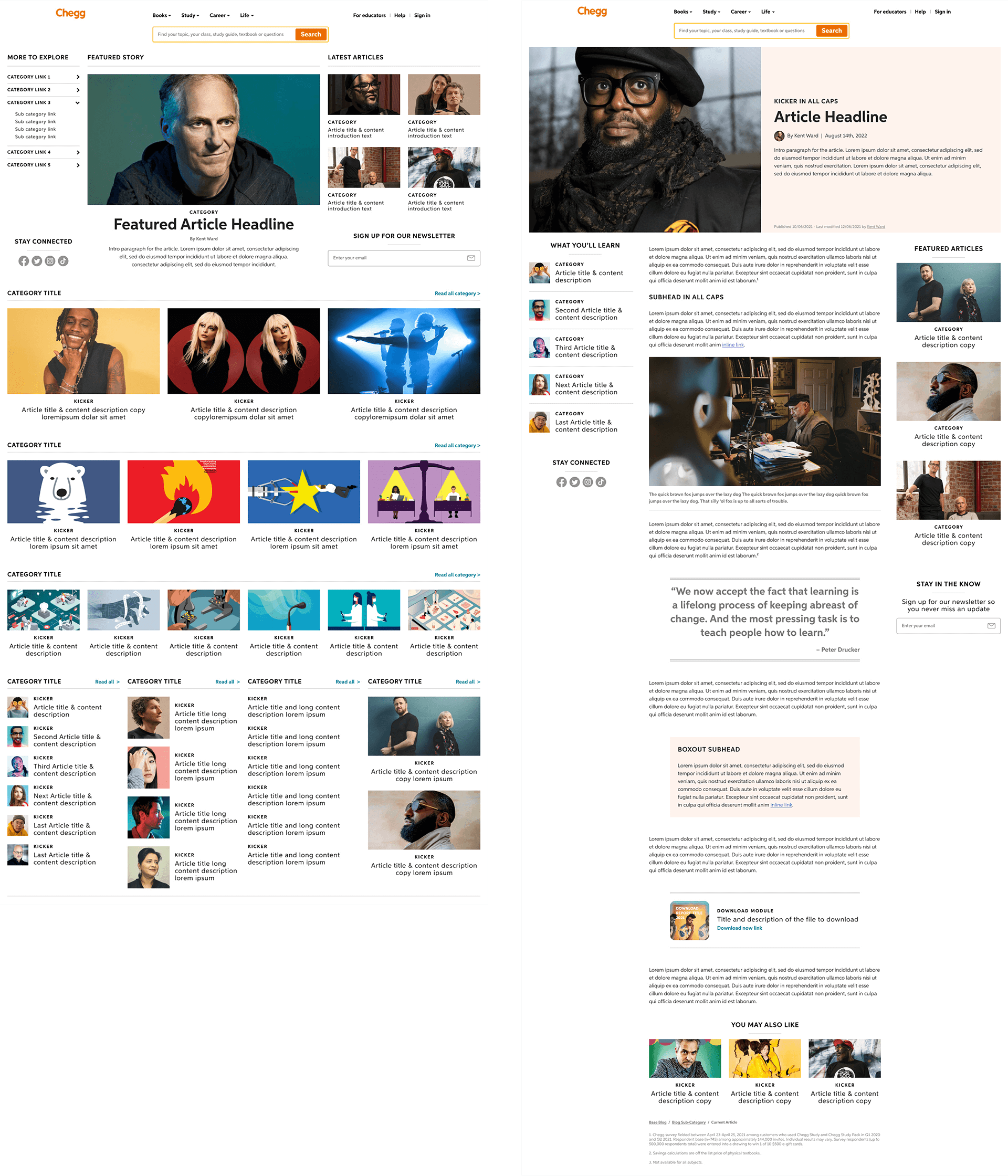
The system was designed with flexibility in mind providing options for landing pages with limited content or multi-category hubs with hundreds of articles to organize. These are just single examples of a possible landing page (left) and article (right).

The Process
Step 1: Gather Inspiration
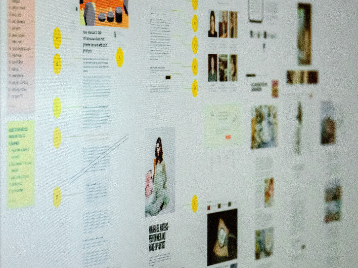
I gathered inspiration from dozens of news and blog sites to help define best practices and establish a base list of features. I met with our editorial team, sales team, SEO, investor relations, and engineering to establish a robust set of requirements.

Step 2: Design Vision Pages
I designed a set of vision pages that showed multiple use-cases and options for both the hubs and article pages. These vision pages acted as visual aids when gaining alignment and collecting feedback from stakeholders.

Step 3: Design Components
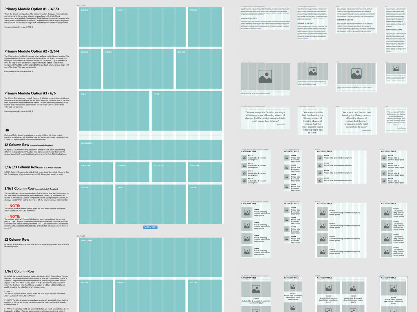
With the prep work complete and alignment gained I designed a robust set of responsive components. By paying special attention to reusable elements and gathering feedback from our development partners throughout the process the final delivered specs were optimized to lower production effort across development and implementation.


