Option 1
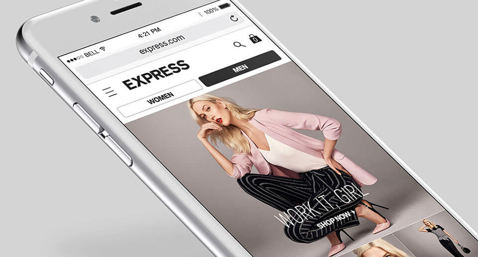
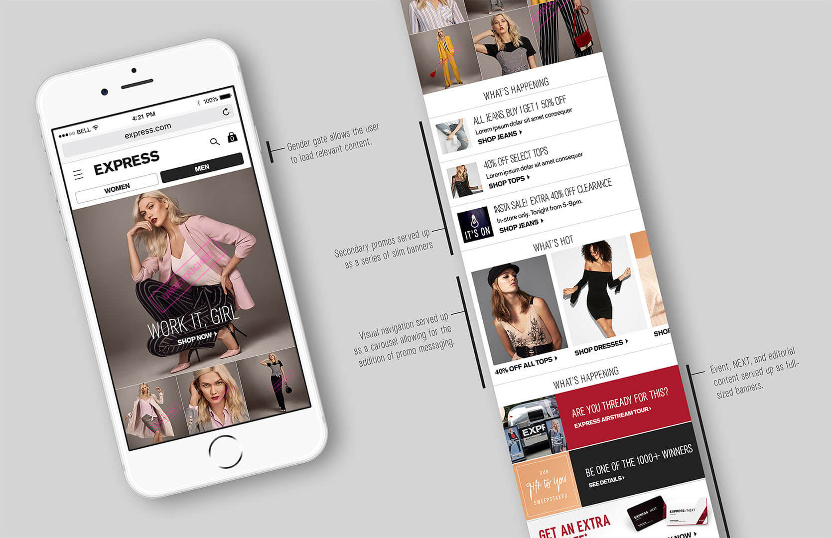
Our first option introduced gender-gating to the top of the page allowing us to lead with women's outfits but giving customers interested in men's clothes an easy path to find what they want. We organized a list of our promotions underneath the primary story followed by a carousel of our main categories and associated sales. The bottom of the page featured banners for our loyalty program, events, and editorial content.
Option 2
Option 2 introduced a tabbed menu of sale, trend, and editorial content. Each selection was populated with a series of 3 slim banners. The height of the hero story was adjusted to allow the tabbed menu and first banner to show above the fold on mobile devices.

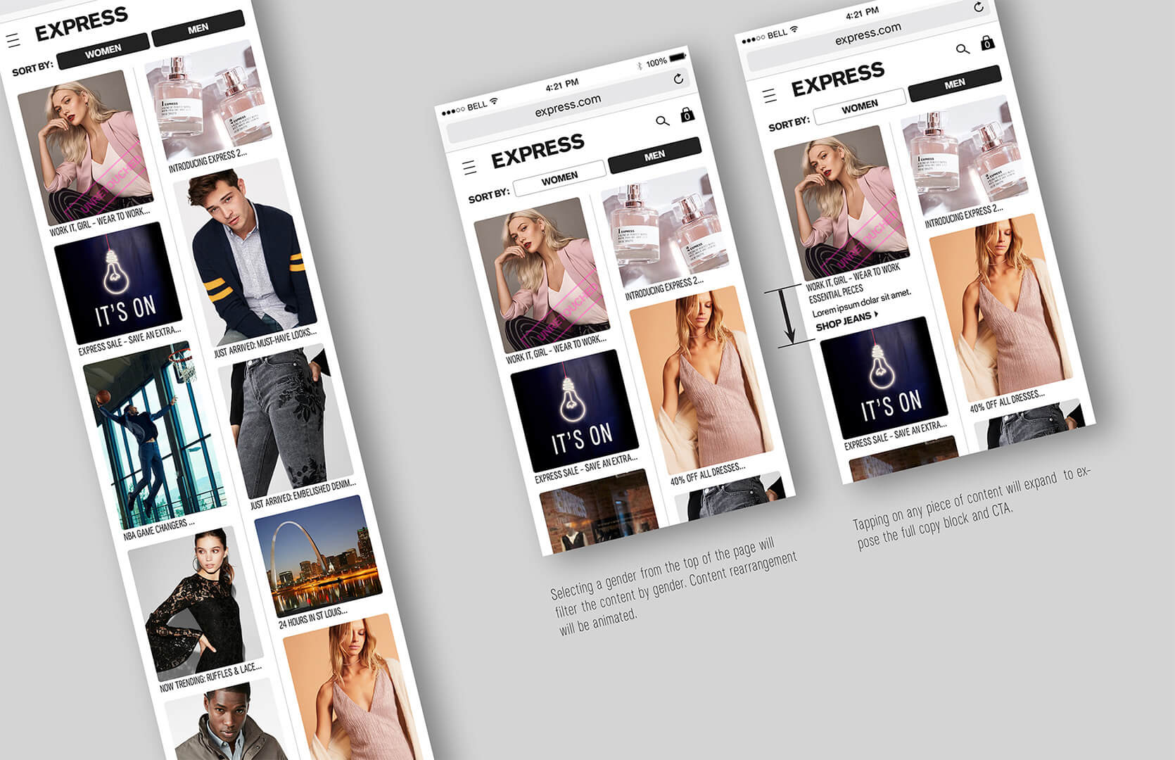
Option 3
This version explored a 2-column layout of mixed content that would refresh dynamically. Interacting with any individual image would expand to reveal additional information.
Option 4
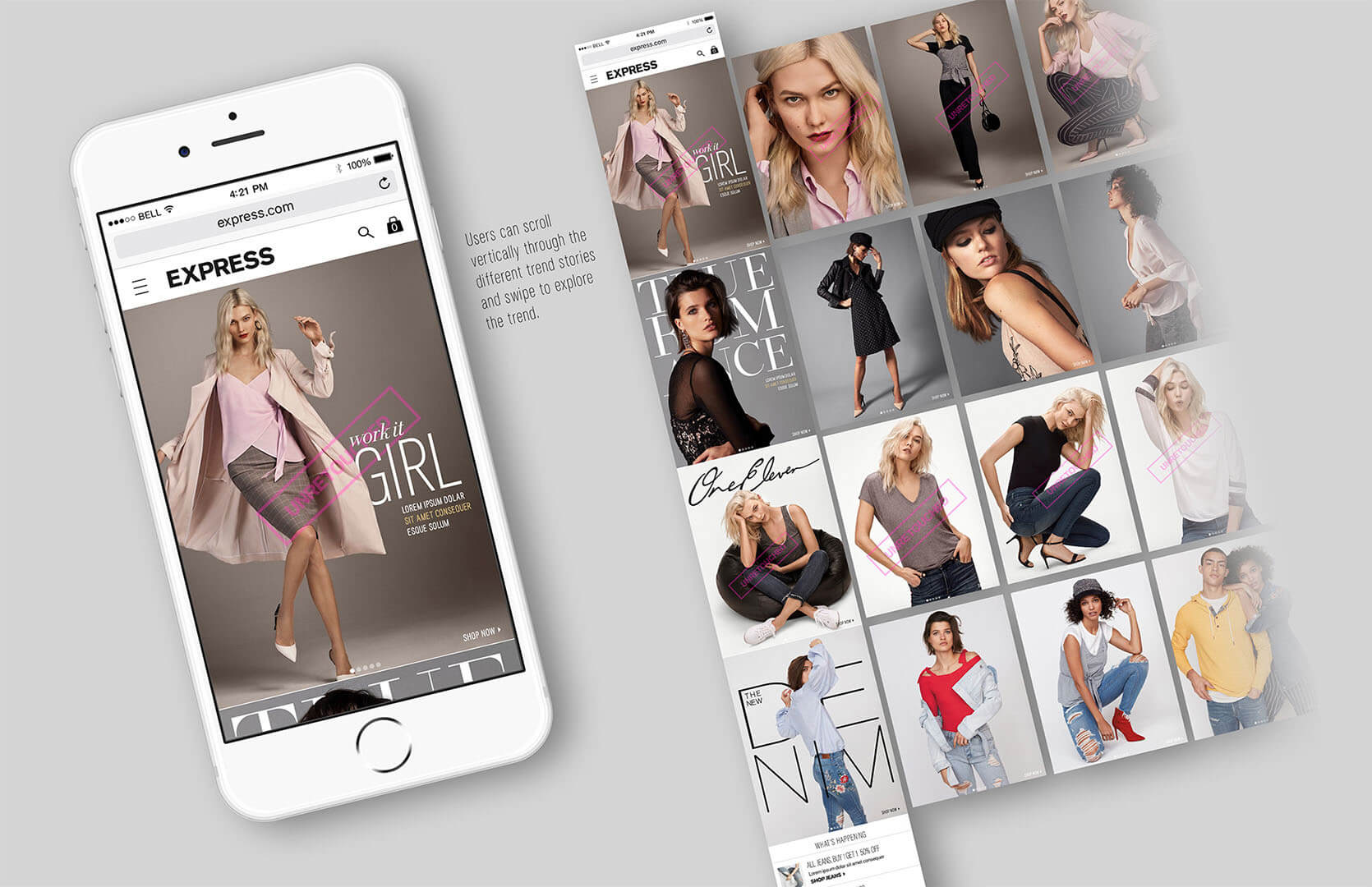
Option 4 brought an editorial approach to our homepage. We wanted to provide a magazine experience where visitors could scroll through our available stories and swipe to explore each story deeper. This layout was meant to be aspirational and inspirational letting the photography be the hero.
